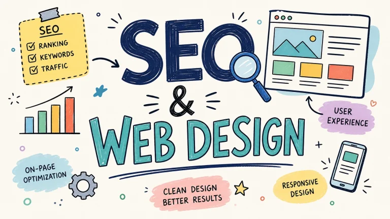

Website Redesign Mistakes Allied Health Professionals Should Avoid
If you’re running a clinic—whether you’re a physio in Parramatta, a chiro in Melbourne, or an OT in regional Queensland—you’re likely wearing more hats than you ever expected. Between treating clients, managing staff, and keeping up with admin, thinking about a website redesign might feel like one more overwhelming task. But here’s the thing: your…
If you’re running a clinic—whether you’re a physio in Parramatta, a chiro in Melbourne, or an OT in regional Queensland—you’re likely wearing more hats than you ever expected. Between treating clients, managing staff, and keeping up with admin, thinking about a website redesign might feel like one more overwhelming task.
But here’s the thing: your website is often the first point of contact for potential clients, GPs, NDIS coordinators, or parents looking for therapy options. If your site looks outdated, loads slowly, or buries the “Book Now” button, you could be losing out on valuable bookings every week—without even realising it.
Redesigning your website isn’t just about making things look pretty—it’s about making your practice work better for you and your clients. That said, there are some common mistakes we see health professionals make when updating their site. Let’s walk through them—so you can avoid the headaches and get it right the first time.
1. Skipping an Audit of Your Current Site
Before jumping into a full redesign, take a step back. What’s working? What’s not? Are clients using your online booking system? Are certain pages (like your “Services” or “About Me”) getting heaps of traffic?
Tip: Check your website analytics (Google Analytics or even Hotjar if you have it). Keep the high-performing stuff and build on it. Don’t throw out the bits that are already working well.
2. Forgetting About SEO
We know SEO can sound like a bunch of jargon—but it really just means making sure the right people can find you online. If you delete high-ranking pages or change URLs without proper redirects, you might accidentally tank your site’s visibility on Google.
Tip: Do your keyword research (think “sports physio near me” or “speech therapy for toddlers”) and plan your redesign around those terms. Always use 301 redirects if URLs change—your future self will thank you.
3. Focusing Only on Looks, Not Function
Sure, a fresh design is exciting—but don’t let aesthetics overshadow usability. Your website needs to be easy for busy parents, NDIS plan managers, and clients with disabilities to navigate.
Tip: Make sure your menu is simple, your contact details are easy to find, and your site works just as well on mobile as it does on a laptop.
4. Ignoring Mobile Responsiveness
More than half of your visitors are likely checking you out from their phones—maybe even while sitting in their car after an appointment. If your site isn’t mobile-friendly, they might click away before they even see what you offer.
Tip: Test your site on your own phone and tablet. Better yet, ask your receptionist or a client to try booking online and watch how they go.
5. Redesigning Without a Clear Goal
What are you hoping to achieve with this redesign? More bookings? Clearer info for NDIS coordinators? Showcasing your team?
Tip: Define your goals early. That way, every design decision—page layout, buttons, content—can support that outcome.
6. Forgetting About Content Quality
Yes, people skim-read. But your content still matters. Are your services clear? Do people understand your expertise? Is your tone warm and approachable?
Tip: Update your content to reflect your current services, funding options (like Medicare, private health, or NDIS), and team. Don’t let an old “Meet the Team” page introduce people who left two years ago.
7. Overloading the Site and Slowing It Down
Health websites often fall into the trap of adding too many graphics, videos, or animations. While those can look nice, they can also slow your site to a crawl—especially on mobile.
Tip: Use tools like Google PageSpeed Insights to check your site speed. Optimise images and avoid overloading pages with too much media.
8. Launching Without Testing
Would you run a treatment protocol without testing it first? The same principle applies here. Broken links, typos, or booking system glitches can make your practice look unprofessional—even if your clinical work is top-notch.
Tip: Test every single page before launch. Try different devices, browsers, and screen sizes. Ask a few friends (or clients you trust) to give honest feedback.
Here’s the Bottom Line
Your website is like the digital front door of your clinic. It should feel welcoming, professional, and easy to use. A thoughtful redesign can save your admin team time, increase bookings, and build trust with new clients—but only if you avoid these common pitfalls.
If you’re thinking about a redesign but don’t have time to mess with SEO, site audits, or broken buttons, you’re not alone. We’ve helped health professionals like you build websites that work for your business and your clients.
Let’s chat about what a smart website redesign could do for your clinic. Reach out today and let’s make it happen—without the headaches.